
Hapio is headless. We give you the booking and scheduling API — services, resources, schedules, bookable slots — and you build the experience your customers see. That works well for the booking flow itself, but sooner or later most projects need a real calendar: a week view that staff can drag bookings around in, a day view that shows where the open slots are, a month view for the overview.
Until now, that meant either reaching for a commercial calendar library or building one from scratch. Neither option is great when your data model already lives in Hapio.
Today we are releasing Hapio Calendar, an open-source, full-sized calendar component for React 19 and shadcn/ui. It ships with week, day, month and list views, drag and resize, per-calendar time zones and recurring events, and it is built to talk to the Hapio API out of the box. It is MIT licensed, and there is no premium tier.
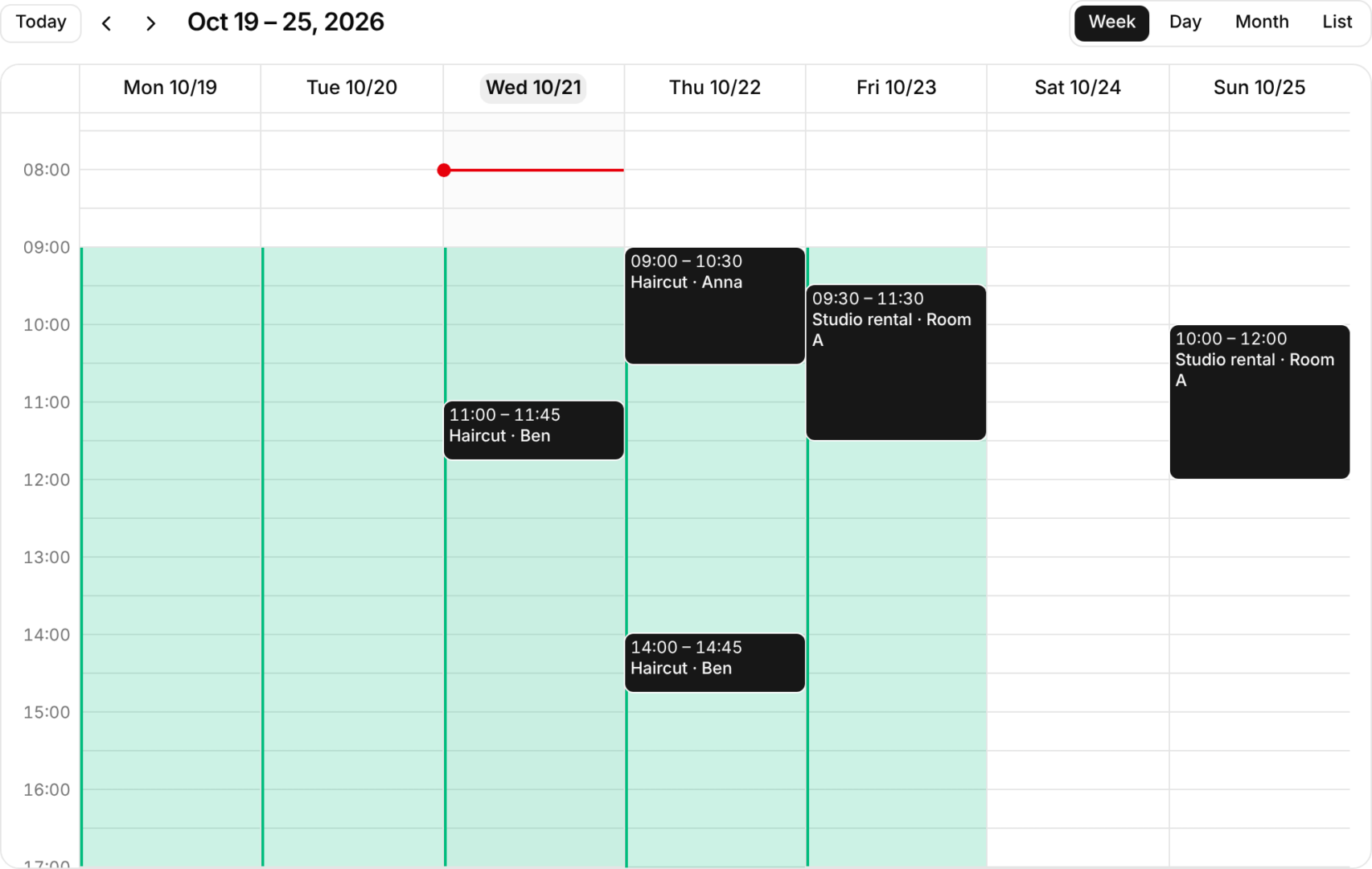
The week view. Opening hours are shaded, bookings sit on the grid, and the red line marks the current time.
What it does
Hapio Calendar is a full calendar, not a date picker. Out of the box it gives you:
- Four views. Week, day, month and list, with the view and date optionally kept in the URL so links are shareable.
- Drag, resize and keyboard editing. Events can be moved and resized with the mouse, or with the keyboard through an actions menu on every event. You can also drag items in from outside the calendar, for example from a list of unassigned bookings.
- Time zones done properly. Each calendar has its own time zone, and you can switch it without remounting. Days with 23 or 25 hours lay out correctly, so daylight saving transitions do not break the grid.
- Booking rules. Opening hours, overlap checks and your own custom checks. When a placement is refused, the calendar tells the user why.
- Optimistic saves. A change shows immediately, sits in a pending state while your API saves it, and reverts if the save fails.
- Recurring events. RFC 5545 series editing, including server-side expansion when the server knows the zone and date.
- Accessibility built in. Keyboard moves, live announcements, and axe checks on every example.
- Localisation. Multiple languages, including Swedish, and right-to-left layouts.
- Server rendering. Works with SSR and React Server Components, and ships with a Content Security Policy guide.
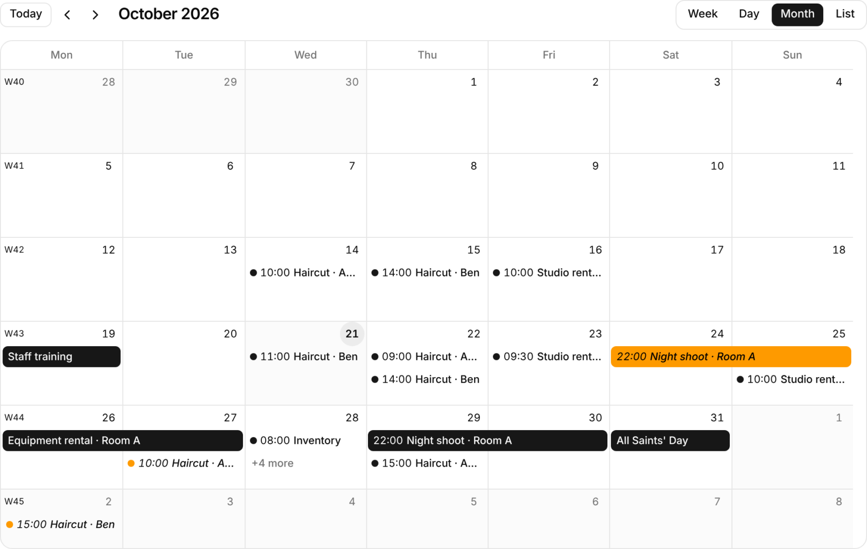
The month view, with ISO week numbers, multi-day events and a “+N more” overflow on busy days.
Built for Hapio
The calendar is a generic component, but it was designed around how a Hapio project actually works. The integration comes down to three callbacks:
- Load. An event source fetches bookings for each visible date range from a route on your server.
- Book. Bookable slots from Hapio are shown as open time. When a customer or staff member selects one, your app creates the booking.
- Reschedule. Drags and keyboard moves call
onEventChange. If Hapio refuses the change — the resource is unavailable, the slot is outside opening hours — the calendar reverts it and shows the reason.
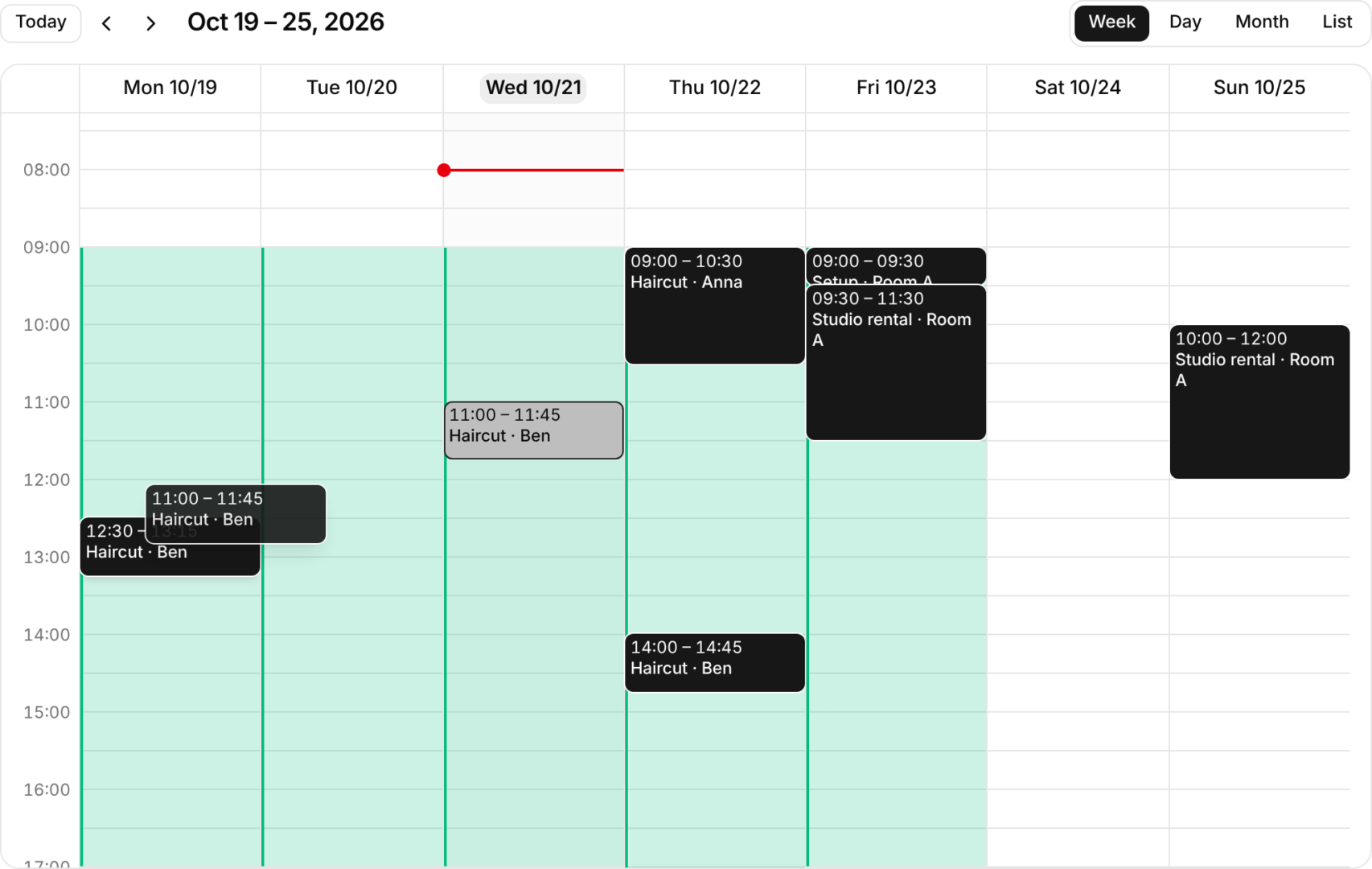
Rescheduling a booking by dragging it. The original slot stays greyed out until your server confirms the change.
As with our admin panel, your API token never reaches the browser. Your server talks to Hapio through the hapio-sdk package, and the calendar only talks to your server. The permissions on the token are enforced by Hapio as usual.
You own the code
We did not want to ship another black-box calendar. Hapio Calendar is split into three layers, and you choose how deep to go:
@hapio/calendar-core— the framework-free logic: layout, time zone maths, rules, recurrence. No React.@hapio/calendar-react— headless hooks on top of the core. Bring your own markup and styling.- The
@hapioshadcn registry — the styled, ready-to-use component. It is installed with the shadcn CLI and copied into your project, so the files are yours to edit like any other shadcn component.
Most projects will start with the registry component and only drop down to the hooks if they need something unusual. Either way, there is nothing you cannot change.
Getting started
You need React 19.2 or later and a shadcn/ui app on Tailwind CSS 4 (either the Radix or Base UI base). For server rendering, Node 22.12 or later.
First, add the @hapio registry to your components.json:
JSON
{
  "registries": {
    "@hapio": "https://calendar.hapio.io/r/{name}.json"
  }
}
Then add the calendar:
Shell
npx shadcn@latest add @hapio/hapio-calendarThis copies the component into components/hapio-calendar/, pulls in the shadcn button, popover and scroll-area components, and installs @hapio/calendar-react and temporal-polyfill. Load the polyfill once at the root of your app, then render the calendar with a height and a time zone:
TSX
<HapioCalendar
  events={events}
  timeZone="Europe/Stockholm"
  className="h-[36rem]"
/>
The base component is read-only. Add calendar-selection to let users pick times, calendar-editing to move and resize events, and calendar-external-draggable to drop items in from outside. The installation guide walks through each step, and Your first calendar takes it from there.
Hapio Calendar is built with React 19, shadcn/ui, TypeScript, Tailwind CSS and the Temporal polyfill, and released under the MIT license. Every example runs through automated accessibility checks, and the test suite ships with the source. Issues and pull requests are very welcome.
Browse the examples, read the docs, or run npx shadcn@latest add @hapio/hapio-calendar and try it in your own project today.
Links: calendar.hapio.io · GitHub repository · Hapio docs · Hapio portal
